Material Design – color
Color Tool
The Color Tool helps you create, share, and apply color palettes to your UI, as well as measure the accessibility level of any color combination.

Create color schemes
Create color schemes that include darker and lighter variations of your primary and secondary colors.

Test accessibility
Check if text is accessible on different-colored backgrounds, as measured using the Web Content Accessibility Guidelineslegibility standards.
Preview your UI in color
Preview the look of your color scheme across a range of Material Design components, with editable HTML, CSS, or JavaScript in Codepen.

Create color palettes for your UI and test color accessibility
Color palette
The color palette
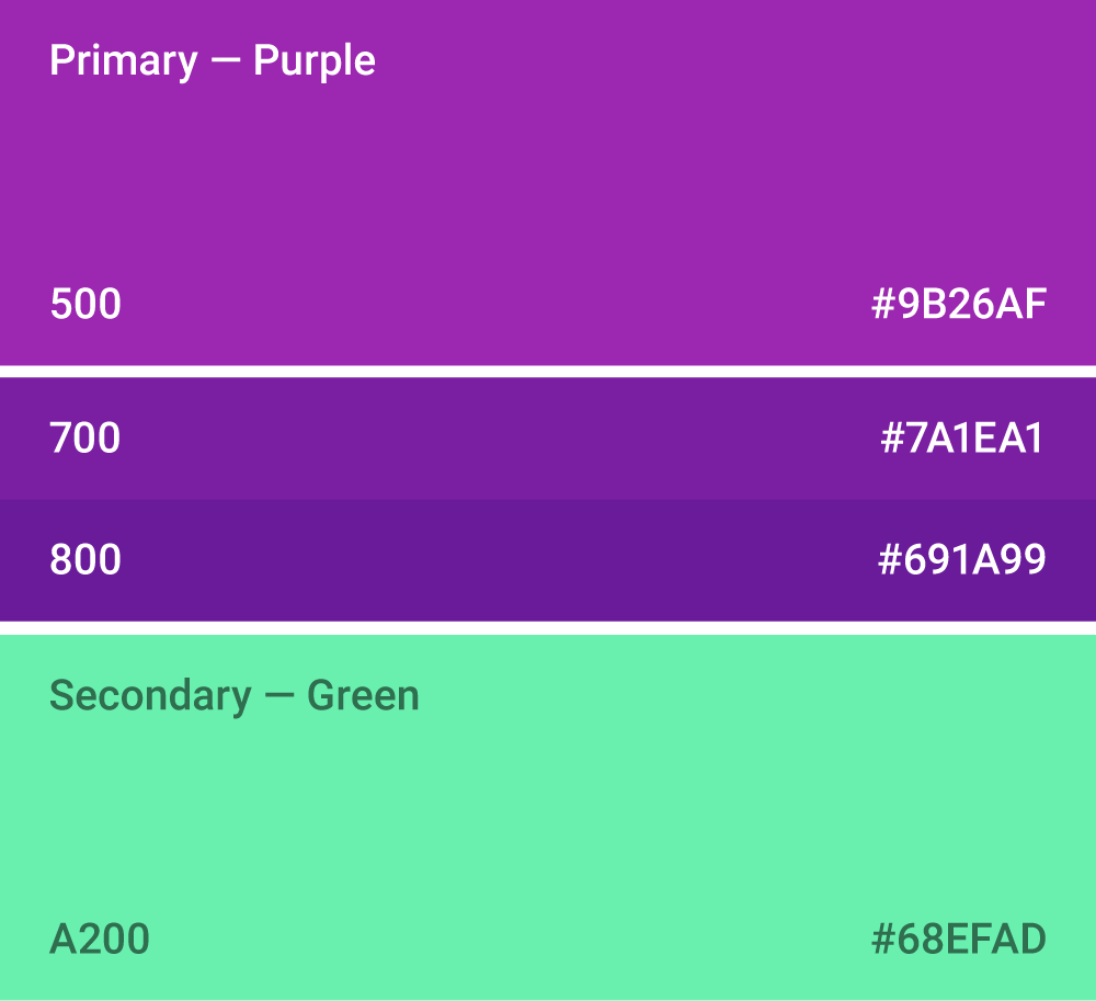
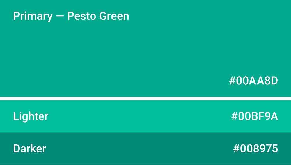
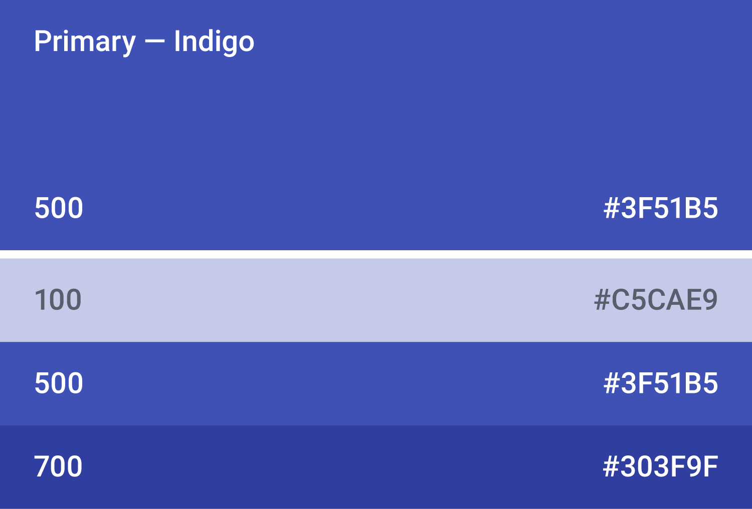
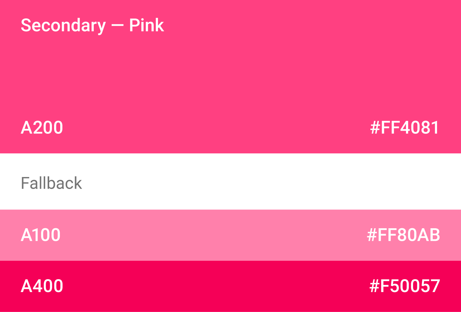
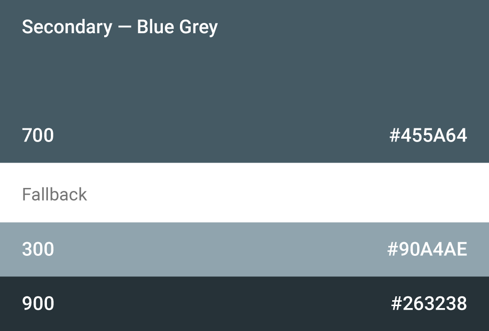
This color palette comprises primary and accent colors that can be used for illustration or to develop your brand colors. They’ve been designed to work harmoniously with each other. The color palette starts with primary colors and fills in the spectrum to create a complete and usable palette for Android, Web, and iOS. Google suggests using the 500 colors as the primary colors in your app and the other colors as accents colors.
Themes enable consistent app styling through surface shades, shadow depth, and ink opacity.

Color system
Choosing a color scheme
You can customize your app’s color scheme to match your brand colors. Alternatively, you can create an entirely new color scheme using the material design color palette.
When creating a color scheme:
- Use the Color Tool to create and apply palettes to your app
- Ensure your app’s color usage meets accessibility standards, with sufficient contrast between elements

A step-by-step guide to staying on-brand with Material Design
Material Design’s color system
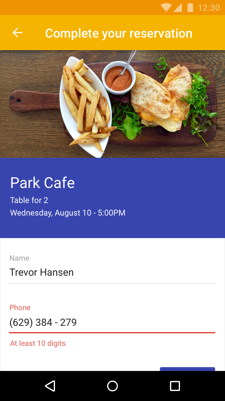
In Material Design, a primary color refers to a color that appears most frequently in your app. A secondary color refers to a color used to accent key parts of your UI.
Using colors from the Material Design palette is optional.
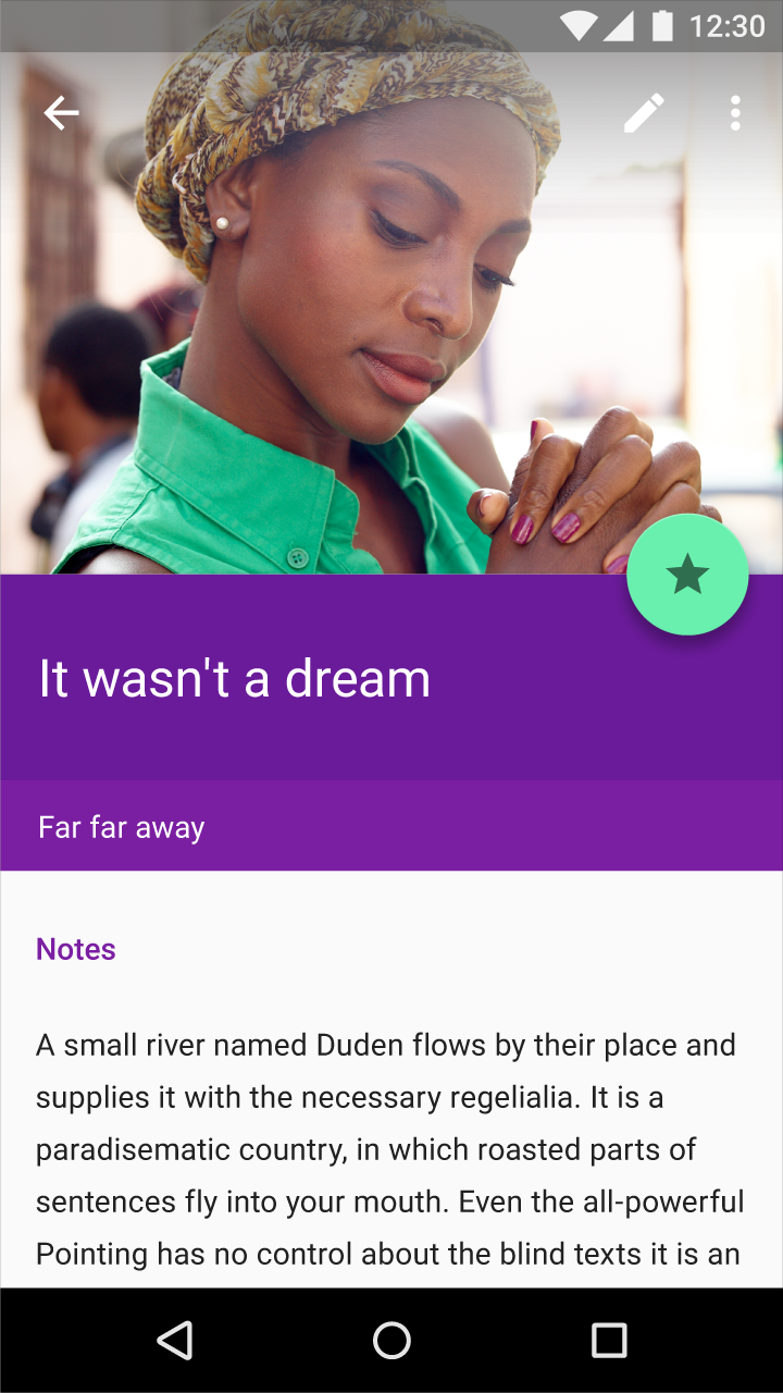
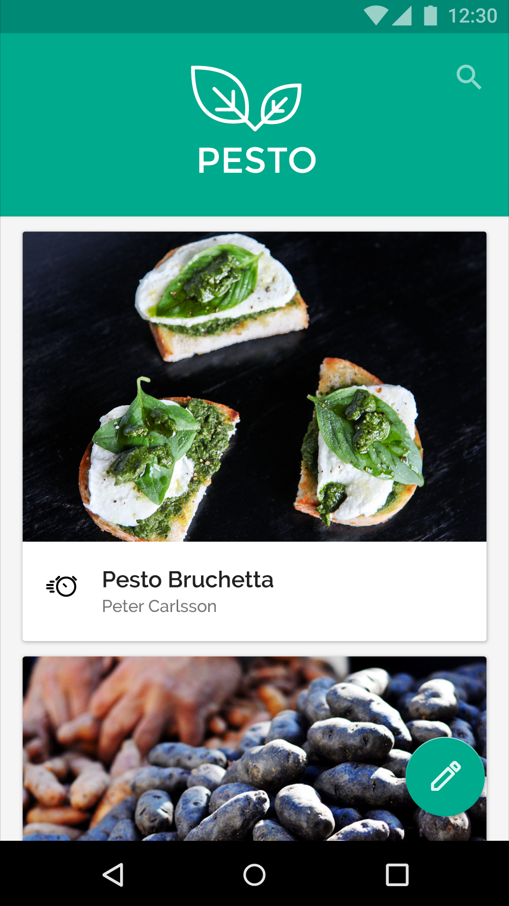
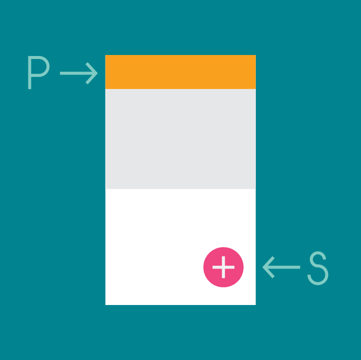
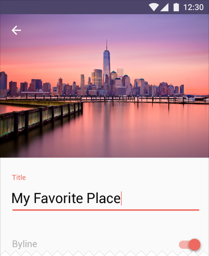
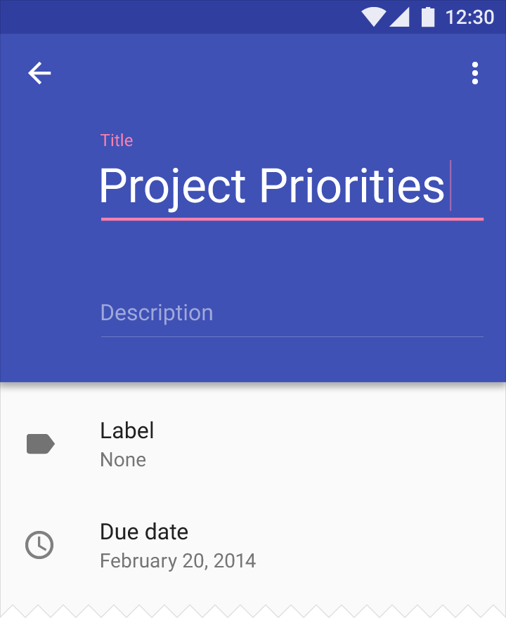
Primary color
A primary color is the color displayed most frequently across your app’s screens and components. It can also be used to accent elements, if you don’t have a secondary color.
To create contrast between elements, you can use lighter or darker tones of your primary color. The contrast between lighter and darker tones helps show division between surfaces, such as between the status bar and a toolbar.
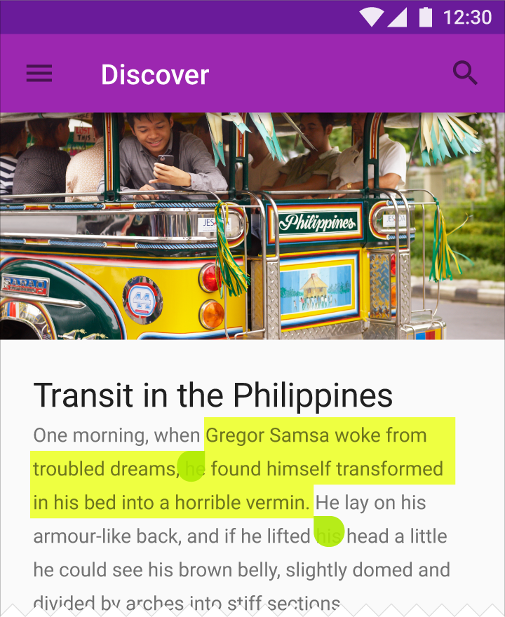
Secondary Color
A secondary color is used to accent select parts of your UI. It can be complementary or analogous to your primary color, but it should not simply be a light or dark variation of your primary color. It should contrast with elements that surround it and be applied sparingly as an accent.
Secondary colors are best used for:
- Buttons, floating action buttons, and button text
- Text fields, cursors, and text selection
- Progress bars
- Selection controls, buttons, and sliders
- Links
- Headlines
Using a secondary color is optional. It’s not necessary if you use variations of your primary color to accent elements.
Using color in your app
Large UI areas and elements should be colored with your primary color. A secondary color can be used to accent smaller areas. If you don’t have a secondary color, you can use your primary color instead for these areas.
Use the primary color to accent elements, such as buttons or checkboxes.
Elements that appear rarely, such as alerts, should be distinct from other elements and not use your primary color.
Secondary colors, and anything used to accent parts of the UI, should be used sparingly.
See the Color Tool for more guidance about typographic legibility on color.
Alternative secondary colors
If your secondary color is too light or dark to sufficiently contrast with the background color, use a lighter or darker shade of the secondary color instead.
Usability
Hierarchy
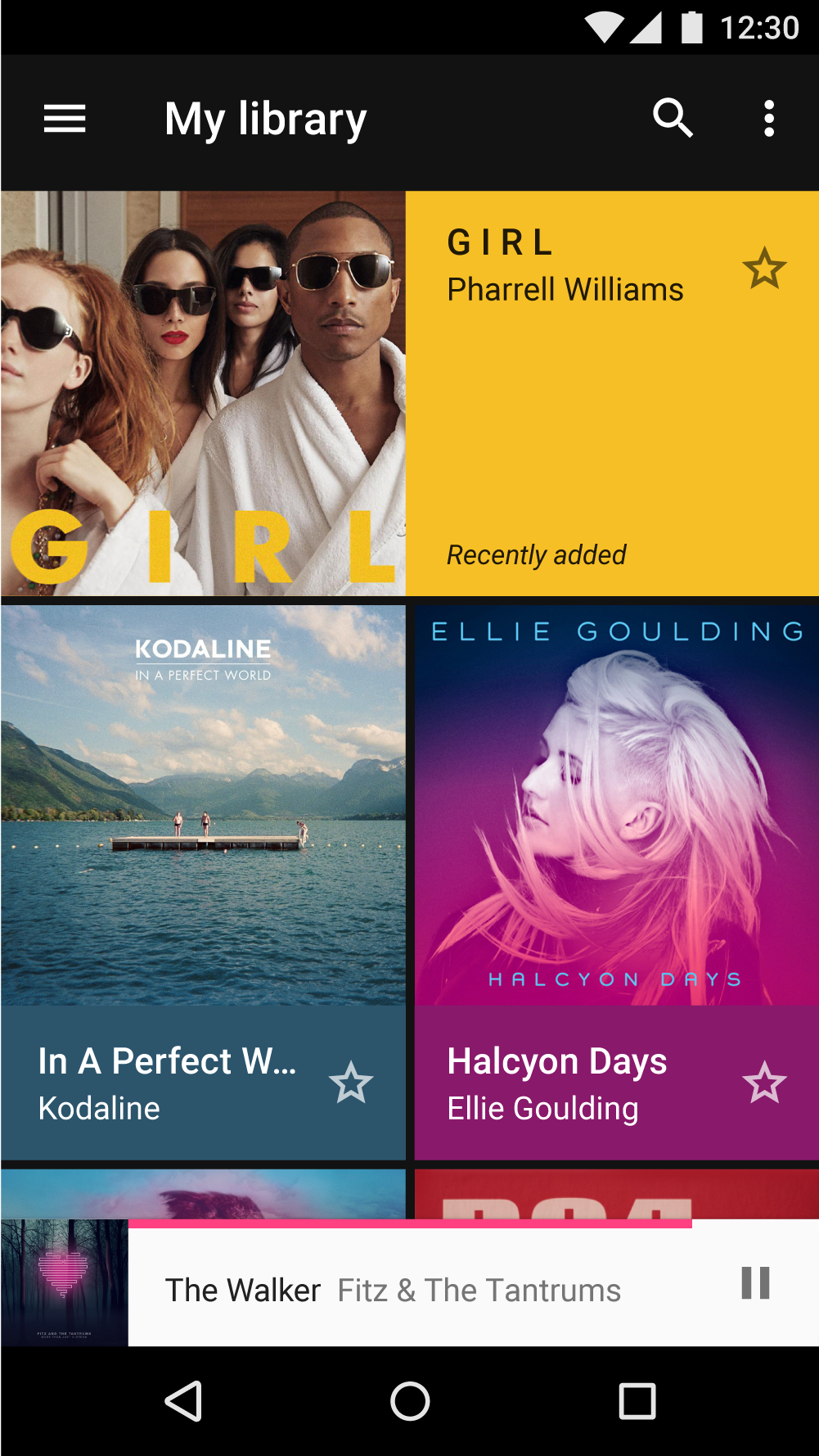
Hierarchy refers to organizing content according to different levels of importance. Color can convey how important some content is relative to other content.
For example, a brightly colored button on a colorless background makes that button stand out. Alternatively, colorless bars and buttons allow bright content to take prominence in a UI.
Meaning
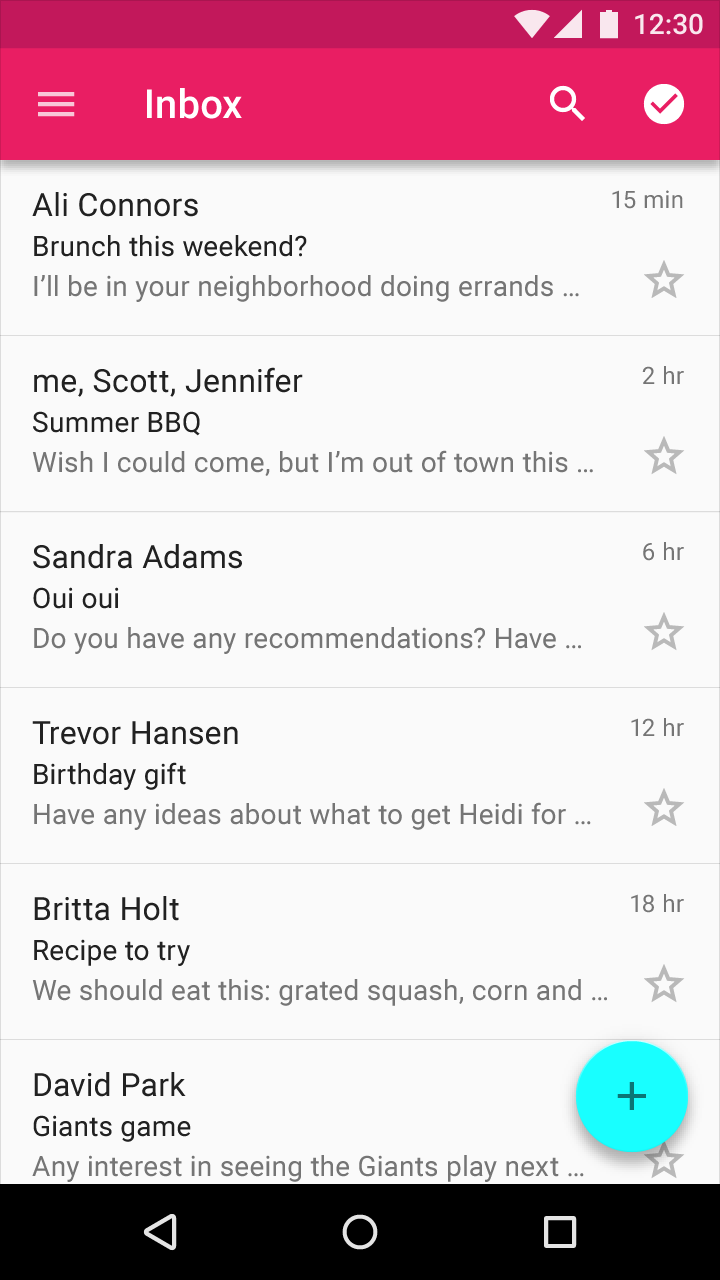
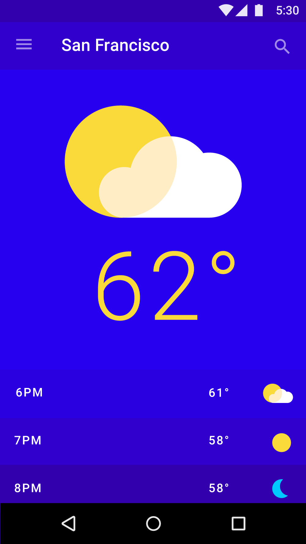
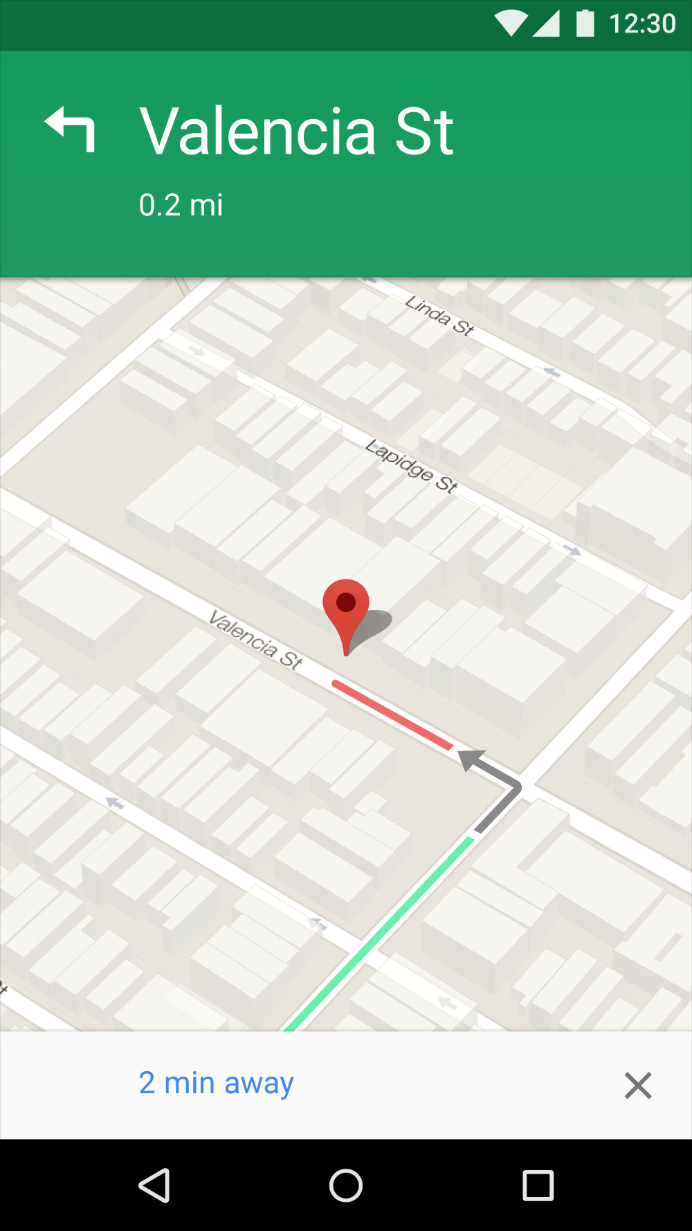
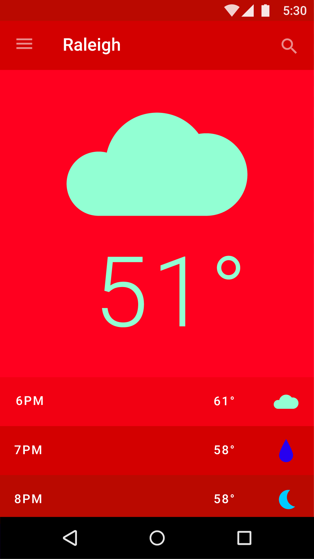
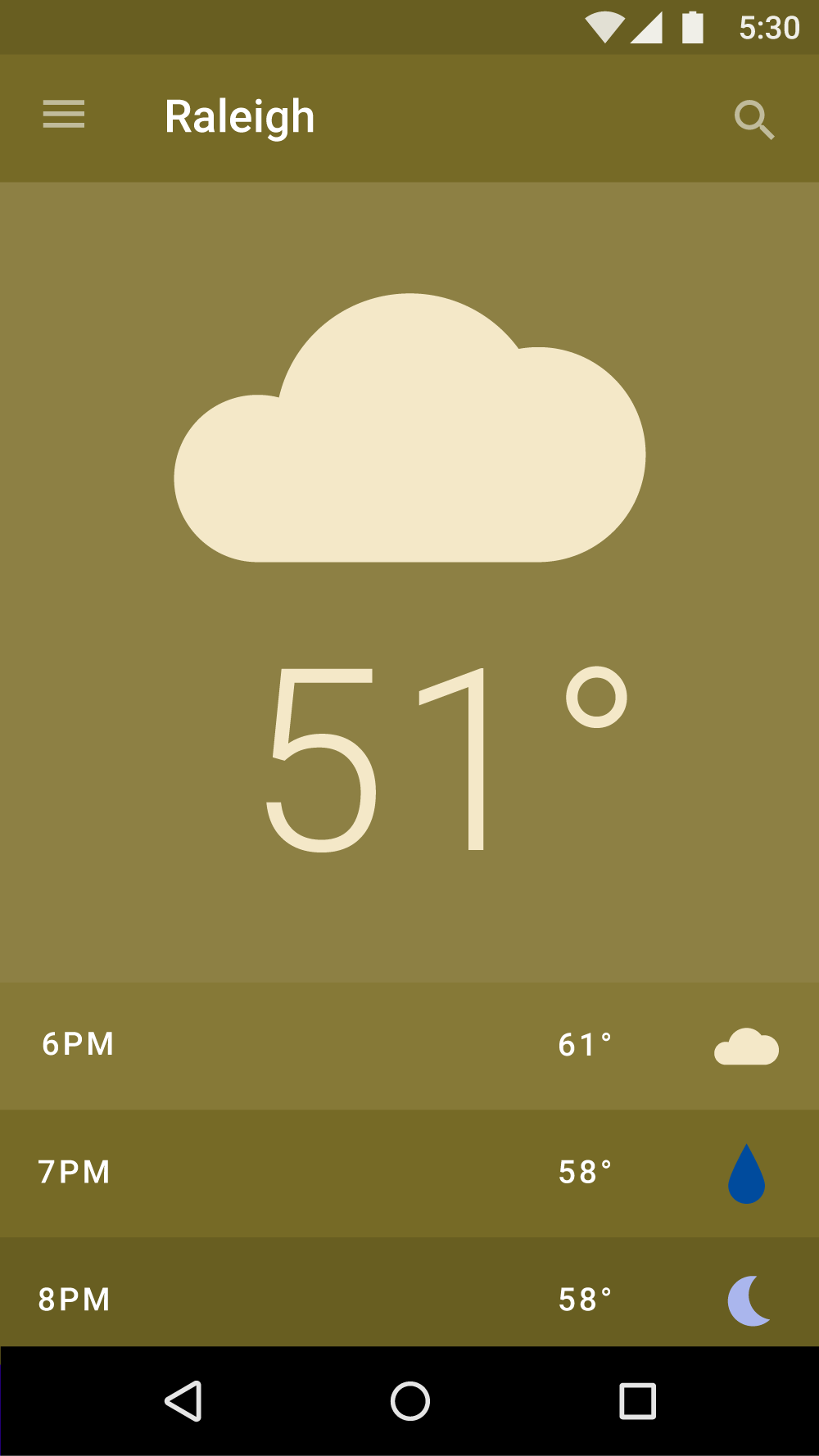
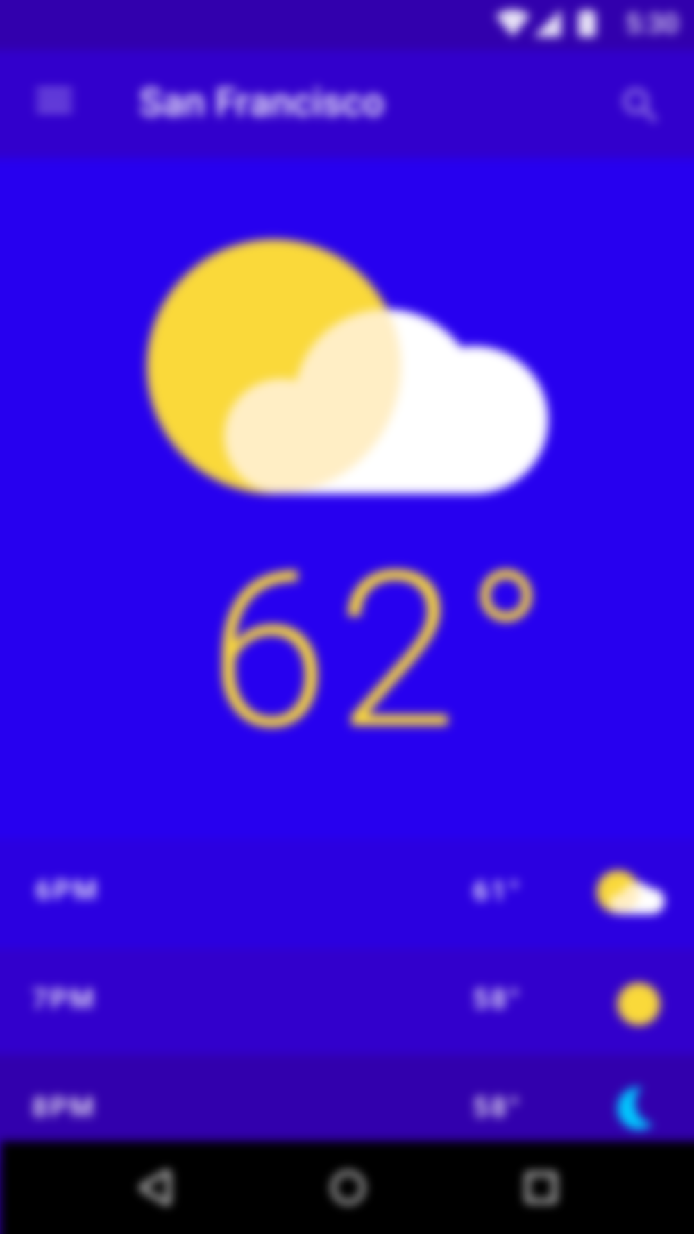
Color may be used to communicate the meaning of various elements on a screen. A weather app may display colors that indicate current weather conditions, and a maps app may use color to show traffic conditions, with roads colored red or green.
State
Color can provide information about:
- An element’s current state, such as if a button is enabled or disabled
- An app or element’s change of state
Color that indicates a change of state should be noticeable, as subtle differences in color may be missed. It’s best to indicate a change of state in more than one way, such as displaying an icon or moving the location of an element.

Contrast
Your app’s primary and secondary colors should ensure sufficient color contrast between elements so that all users can see and use your app.
To learn more about color, contrast, and accessibility design, read Material Design Accessibility.
Text on backgrounds
Text should be legible on the background on which it appears. It is recommended that:
- Dark gray text is used on light backgrounds
- Light gray text is used on dark backgrounds
If your app has both light and dark themes, the text should be available in a contrasting color against each theme.
Legibility
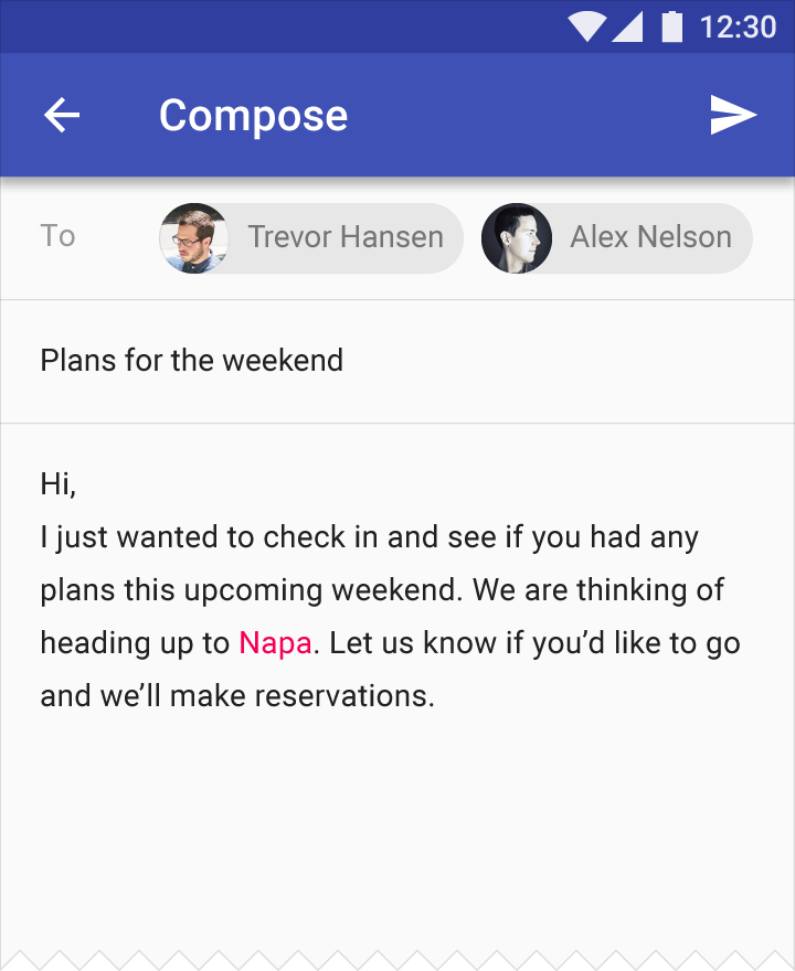
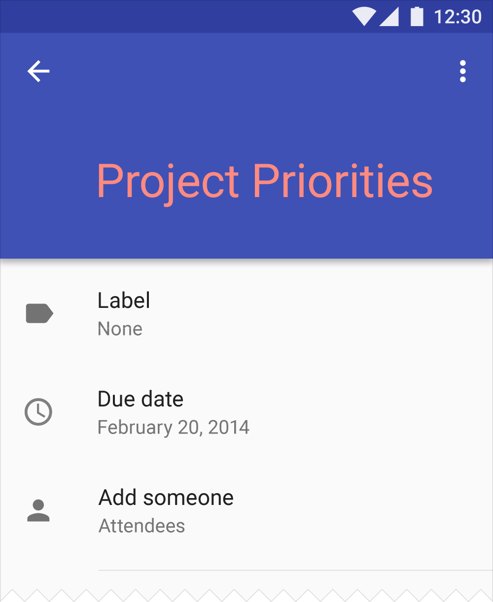
Text that appears on colored backgrounds should be legible and meet accessibility standards. Both backgrounds and text must use colors and opacities that, when used together, meet these standards. The Web Content Accessibility Guidelines (WCAG 2.0) level AA requires a contrast ratio of 4.5:1 for normal text and a 3:1 ratio for large text.
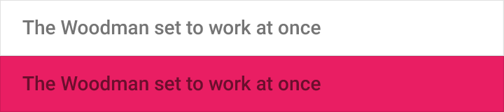
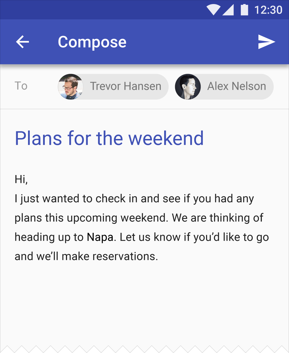
Dark text on light backgrounds
The level of opacity used for text depends on whether your background is dark or light. For dark text on light backgrounds, apply the following opacity levels:
- The most important text has an opacity of 87%
- Secondary text, which is lower in the visual hierarchy, has an opacity of 54%
- Text hints (such as text fields and labels) and disabled texthave even lower visual prominence with an opacity of 38%
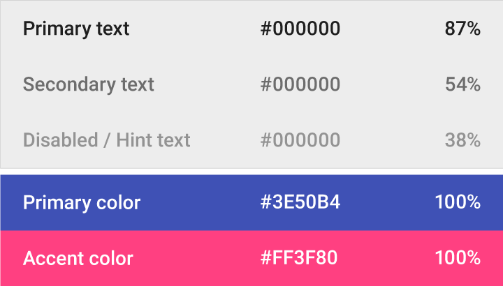
| Dark text (#000000) | Opacity |
| Primary text | 87% |
| Secondary text | 54% |
| Disabled text, hint text | 38% |
| Dividers | 12% |
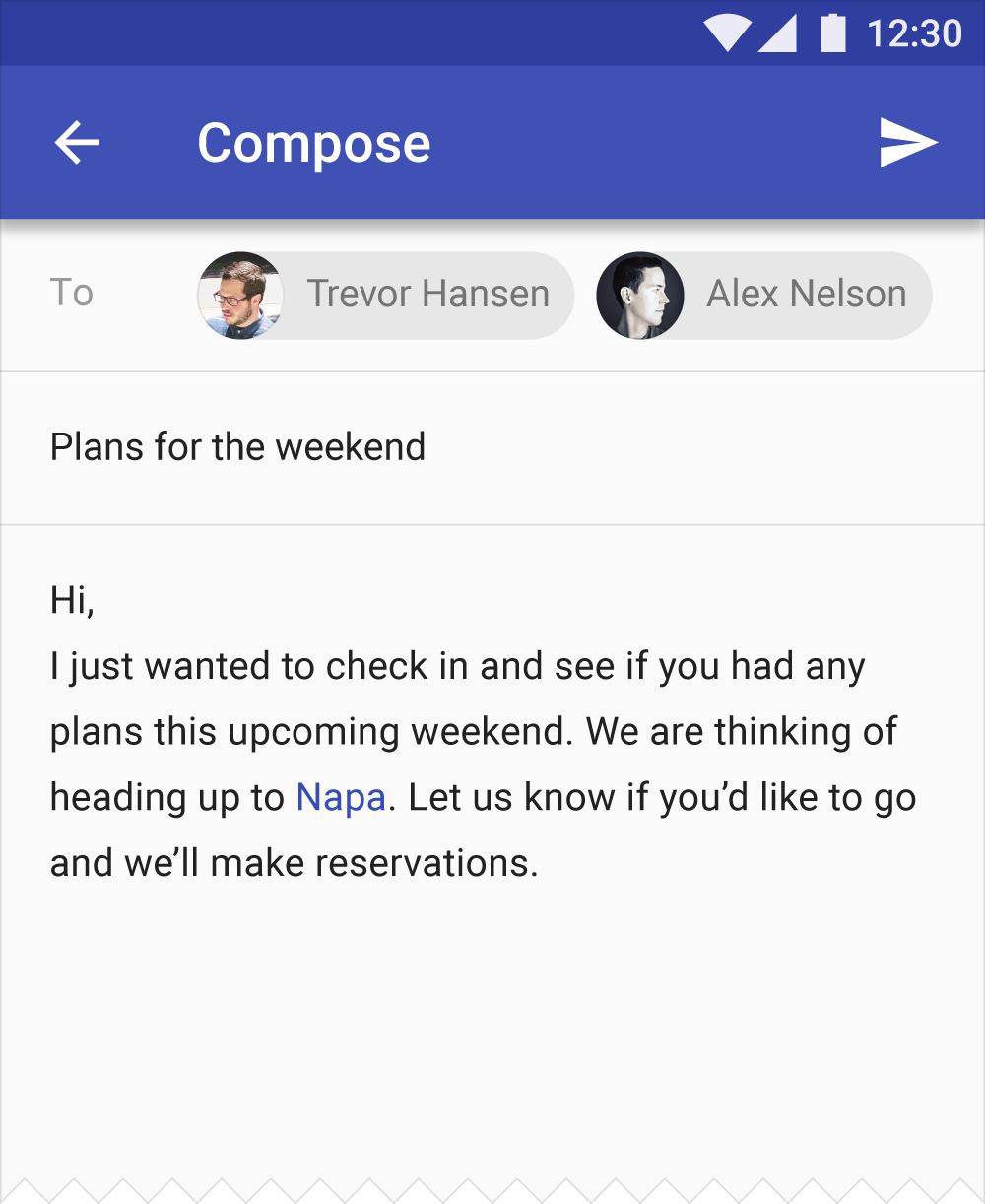
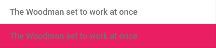
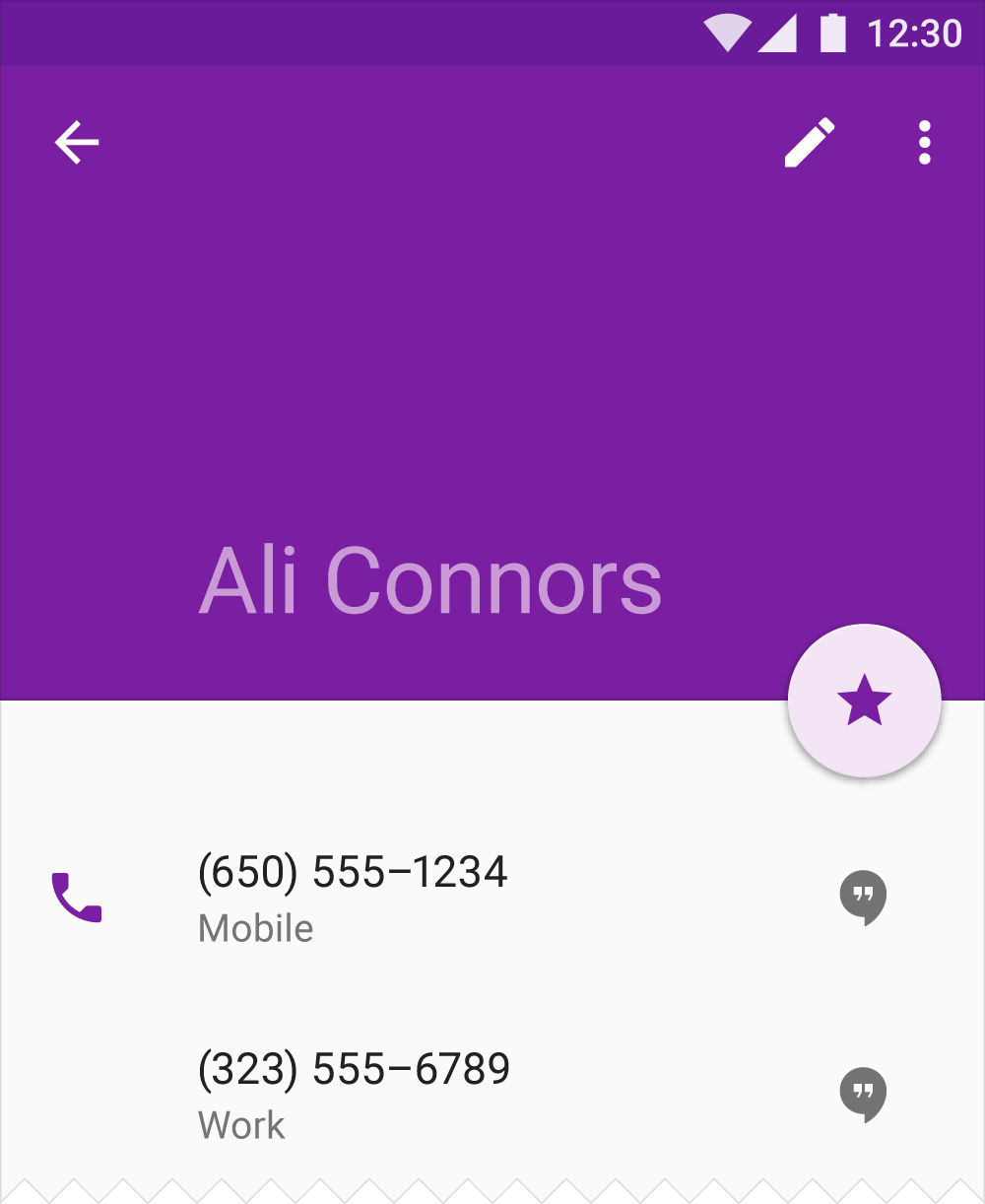
White text on dark backgrounds
White text appearing on colored backgrounds should do so at an opacity of 100%.
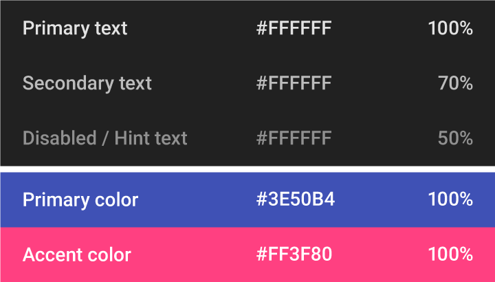
| Light text (#FFFFFF) | Opacity |
| Primary text | 100% |
| Secondary text | 70% |
| Disabled text, hint text | 50% |
| Dividers | 12% |
Icons and other elements
Elements like icons benefit from having a hex value of black or white at 38% opacity so that they work on backgrounds of any color.
| Dark icons (#000000) | Opacity |
| Active Icon | 54% |
| Inactive Icon | 38% |
| Light icons (#FFFFFF) | Opacity |
| Active Icon | 100% |
| Inactive Icon | 50% |
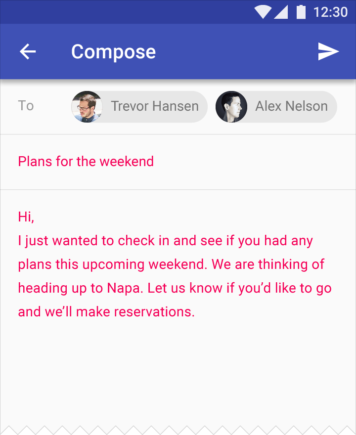
Colored text and backgrounds
Use colored text on colored backgrounds sparingly, limiting usage to important text elements. Colored text should be used to indicate importance and selective emphasis.
See the Color Tool to determine if certain foreground colors used for typography meet accessibility standards against different background colors.

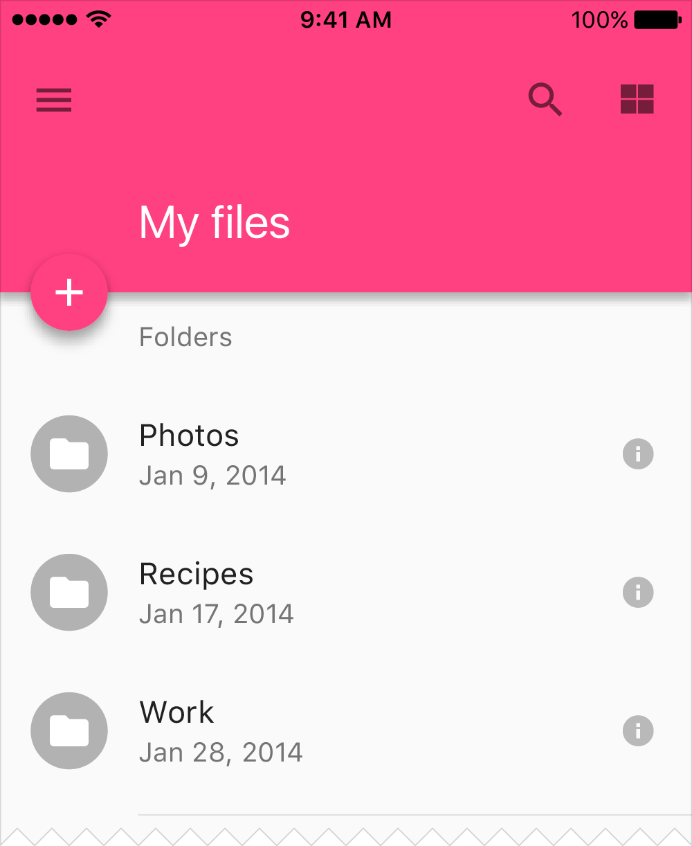
Themes
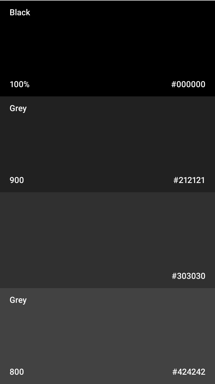
Themes let you apply a consistent tone to an app. The theme specifies the darkness of the surfaces, level of shadow, and appropriate opacity of ink elements. To promote greater consistency between apps, light and dark themes are available to choose from.
1.23 MB (.ai)
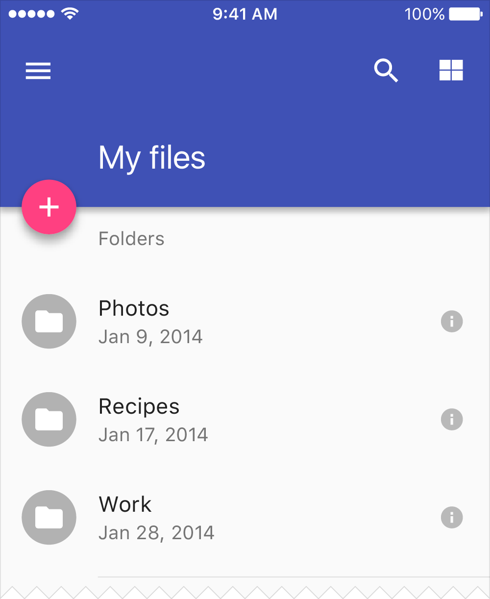
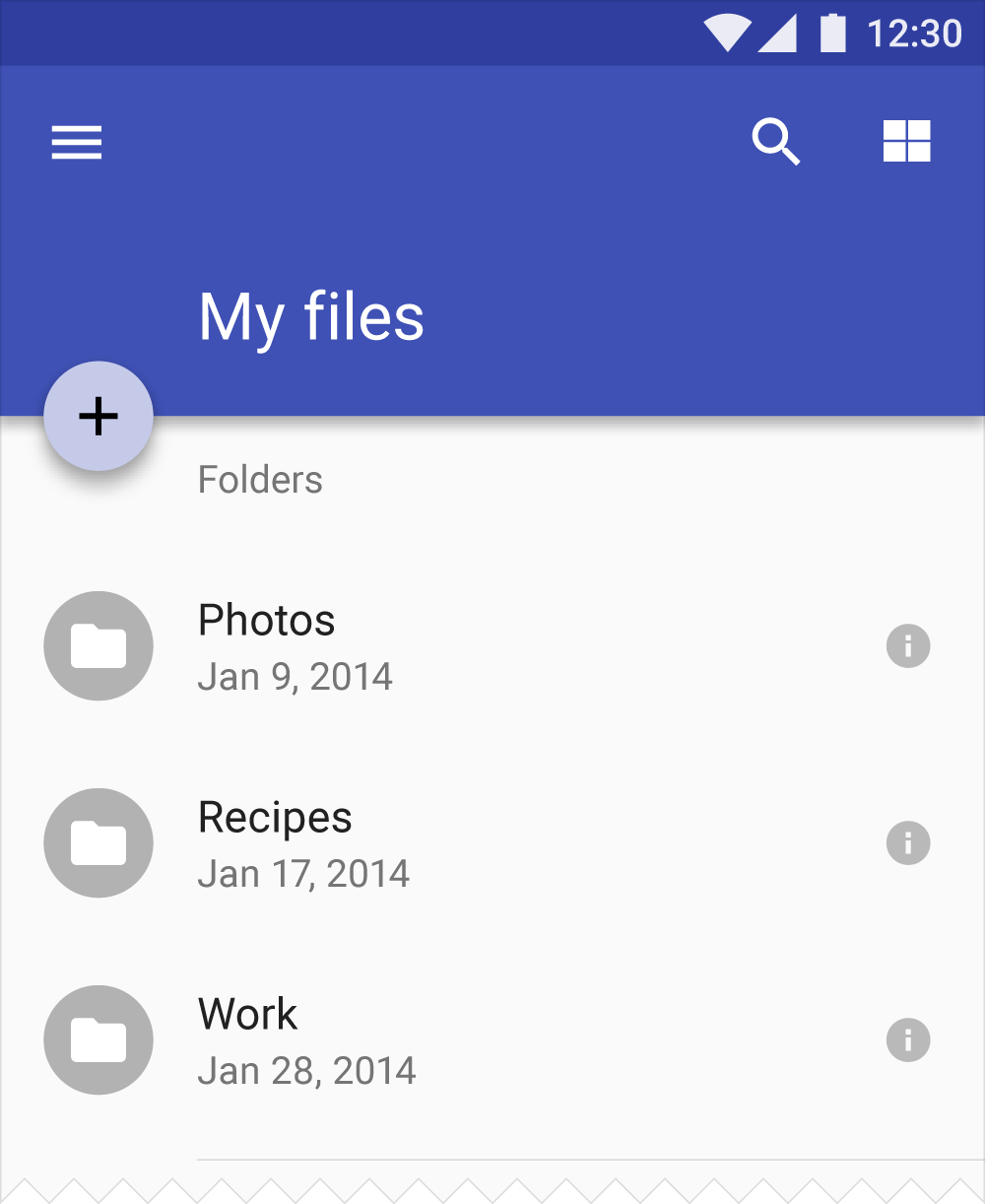
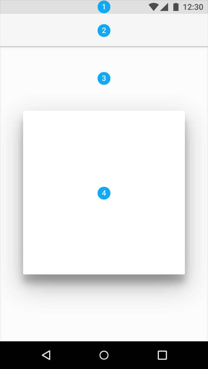
Light theme
1. Status bar
2. App bar
3. Background
4. Cards/Dialogs
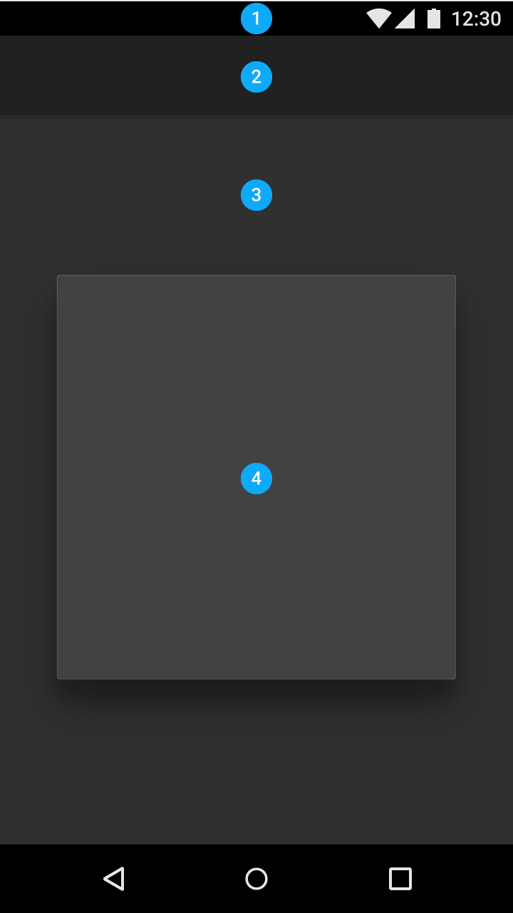
Dark theme
1. Status bar
2. App bar
3. Background
4. Cards/Dialogs

Customize the design to your brand identity.
既然来了,说些什么?